Saturday 29 November 2014

Week 14: CSS Animations

What is CSS Animations?

CSS Animations is a proposed module for Cascading Style Sheets that allows the animation of HTML document elements using CSS.With CSS3, we can create animations which can replace Flash animations, animated images, and JavaScript's in existing web pages.


Browser Support? 


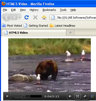
Here is a video to demonstrate how use use certain css animations:


With CSS animation now supported in both Firefox and Webkit browsers, there is no better time to give it a try. Regardless of its technical form, whether traditional, computer-generated 3-D, Flash or CSS, animation always follows the same basic principles. In this article, we will take our first steps with CSS animation and consider the main guidelines for creating animation with CSS. We’ll be working through an example, building up the animation using the principles of traditional animation. Finally, we’ll see some real-world usages.


Before diving into the details, let’s set up the basic CSS:
Animation is a new CSS property that allows for animation of most HTML elements without JavaScript or Flash. At the moment, it’s supported in Webkit browsers, including Safari 4+, Safari for iOS (iOS 2+), Chrome 1+ and, more recently, Firefox 5. Unsupported browsers will simply ignore your animation code, so ensure that your page does not rely on it!
Because the technology is still relatively new, prefixes for the browser vendors are required. So far, the syntax is exactly the same for each browser, with only a prefix change required. In the code examples below, we use the -webkit syntax.
All you need to get some CSS animation happening is to attach an animation to an element in the CSS:
/* This is the animation code. */
@-webkit-keyframes example {
   from { transform: scale(2.0); }
   to   { transform: scale(1.0); }
}

/* This is the element that we apply the animation to. */
div {
   -webkit-animation-name: example;
   -webkit-animation-duration: 1s;
   -webkit-animation-timing-function: ease; /* ease is the default */
   -webkit-animation-delay: 1s;             /* 0 is the default */
   -webkit-animation-iteration-count: 2;    /* 1 is the default */
   -webkit-animation-direction: alternate;  /* normal is the default */
}


Principles of Traditional Animation

Squash and Stretch 

The crude bouncing ball is a great demonstration of this first point. If the ball falls at a high velocity and hits the floor, you’ll see it squash down from the force and then stretch back out as it bounces up.
At a basic level, this should give our animation a sense of weight and flexibility. If we dropped a bowling ball, we wouldn't expect it to flex at all it might just damage the floor.

Staging

Try to give a stage to the scene; put the animation in context. Thinking back to Disney films, what would they be without the fantastic background artwork? That’s half of the magic!
The stage is also key to focusing attention. Much like on a theater stage, lighting will be cast on the most important area. The stage should add to the illusion. With our bouncing ball, I’ve added a simple background to focus on where the ball will land. Now the viewer knows that the action will take place in the center, and the scene is no longer lost in snow.

For more information and example follow the links below:


Friday 28 November 2014

Week 13: Infinite Scrolling

Our blog this week focuses on the topic of Infinite Scrolling. What comes to your mind when you hear the term infinite scrolling ?


Infinite Scrolling is a web design technique that prevents the browser scroll bar from scrolling to the bottom of the page, causing the page to grow with additional content instead. Infinite Scroll is a feature that loads the next set of posts automatically when visitors approach the bottom of the home page or posts page. It’s designed to help visitors read through many posts without effort.
When you get to the bottom of the page, you’ll see a loading icon display briefly as the next seven posts load below.


Some advantages of Infinite Scrolling

Perfect for Touch

It is of utmost importance to have equally good UX on both desktop and mobile devices. And since most of the tablets and mobile phones are made with touch technology you would prefer to focus on touch optimization. The small screen size of a mobile device demands a forward-thinking technology to display the content in a way that is more convenient for the user. Making users to tap those tiny page links to get to a new bunch of content is far from being usable.

Visual Oriented

Who doesn’t like high quality beautiful images? This is probably another emerging trend on the web that is based on “a picture is worth a thousand words” principle. And the best way to deliver image-heavy content appears to be infinite scrolling. This way users won’t be distracted from their delightful experience by the need to find and click the next link. Pinterest and Flickr are great examples of how visual oriented websites benefit from infinite scrolling.

Better Content Exposure

Regardless of the type of content your website is offering you would like to get as much impressions for it as possible. In case of content pagination users won’t see what’s on the next page until they click it, while infinite scrolling puts all your content on one endlessly long page. Everything is within a “scroll’s reach”.
Fast and Easy Browsing
Infinite pages are usually faster than regular webpages. The reason is that as the user scrolls down the page, more content loads automatically in the same page eliminating the need for clicking on page links and reloading pages every time. This saves time, which is good not only from a user’s but also from SEO perspective.

More Room for Creativity
Infinite scrolling itself is a quite innovative way for displaying information, yet it also holds a huge potential for creative outbursts. In the hands of a web design virtuoso infinite scrolling can turn into something not only interesting and usable but also fun. A very popular creative extension of infinite scrolling is the parallax scroll technology that creates beautiful visual storylines through scrolling.
This is how a website with Infinite scrolling looks like:


Some disadvantages of Infinite Scrolling 


Footer Problem
This is a very big issue especially for ecommerce websites. If you have made an online purchase at least once you know exactly where all the important links are located: in the footer. Now imagine you want to visit the “Shipping information” page on an infinite scrolling webpage. Catch it if you can! It is pretty annoying when you have just a few seconds to find and click on that link until it “scrolls away”.

Disorientation
Everything there is on the web is basically recreated from the real world, right? From this point of view anything that is infinite is already unnatural and contradictory. If there is no order we won’t be able to handle the immense amount of information that flows into our lives every day. And we come across the same issue with infinite scrolling. It lacks orientation and users have difficulty finding something they have previously seen on the page. They are unable to mentally locate that item and easily come back to it afterwards. In case of paginated content at least you can relatively map the information with the help of page numbers.Moreover, that scroll bar on the left gives inaccurate information about the amount of content that is left to load and users feel cheated and annoyed when they realize there is still more to come.

Navigation Issues
One of the very basic UX principles states that users need to always know where they are in the hierarchy of a website. This is essential for website usability. In case of infinite scrolling it is very difficult if not impossible to understand where you are at a given point. Moreover, when you click on an item and then want to go back where you left, the “pogosticking” thing happens and you are brought back to the very top of the feed. Imagine how annoying that is.

No Skipping
One of the biggest advantages of paginated content is that when needed you can skip the first let’s say 100 pages and go straight to 101st, which is impossible with infinite scrolling. Users can’t even nearly imagine the amount of content there is, let alone skip a part of it.
Browser crash. No new technology works flawlessly on all browsers and infinite scrolling is not an exception. When a big amount of content is loaded the memory of a computer, especially an older one can easily crash. You don’t want such UX, do you?

Overwhelming Content
It’s always good to have lots of quality information on a website. But when there is infinite content loading every second users may feel out of control and exhausted. It’s like a pleasant road trip that has no destination and never ends. Knowing there is so much more information out there users are unable to stop until they get bored and psychologically daunted.

Hear is a clip of how infinite scrolling is implemented using word press


A very good example of such creative approach can be found below:
Link 1
Link 2

Friday 21 November 2014

Week 12: Parallax Scrolling

This weeks blog will be exploring the topic of Parallax Scrolling. What comes to mind when you hear the term?

Parallax scrolling is a special scrolling technique in computer graphics, wherein background images move by the camera slower than foreground images the term “parallax” first came from the visual effect of 2D side scrolling videogames that used different background image movement speeds to create the illusion of depth during gameplay. This was generally done by making the background of the game move slower than the foreground in order to make it seem further away. This same concept applies to parallax site design in which the background of the website moves at a different speed as the rest of the page for an impressive visual effect that allows for countless creative applications for online storytelling.

The Advantages:
Parallax design gives websites a great opportunity to:

  • Wow viewers with page depth and animation
  • Take a story-telling approach to guide visitors through the site
  • Make page visits last longer by encouraging visitors to scroll through the entire page
  • Provoke curiosity
  • Direct visitors to calls to action
  • Reenforce website credibility with innovative interactive viewing
How a website with parallax scrolling looks:


The Disadvantages:

With all of these benefits of parallax site design, there are also several downsides to having a parallax site. Most of these problems stem from the fact that the majority of parallax websites only have a single long page which is extremely detrimental to the site’s SEO as well as load speed. Here are some of the negatives to using parallax scrolling design:

  • SEO takes a hit, websites with a single page allow only one set of meta information, one effective h1 tag, and one URL
  • A ton of images and other information on one page cause slow load times, causing frustrated visitors to leave the page before they even see it
  • Not compatible with responsive and mobile design
  • No internal page linking throughout the website

Tips:
A few more things to keep in mind when you’re designing a parallax website are:

  • Don’t overdo it to make your site too complicated
  • Use it to tell a visual story
  • Make it fun and engaging with depth using layering
  • Emphasize calls to action when directing the visitor through the site
  • Account for older browsers and mobile browsing
Here are some links to interesting parallax solutions I've come across:
SoneilNoir

Want to explore some Parallax Scrolling website like the link below
LINK

Thursday 13 November 2014

Week 11 :Browser Compatibility

In this weeks blog we will be looking into the topic of Browser Compatibility

If you’ve tried using different Web browsers to surf to your favourite online hangouts, you’ve probably noticed that the same sites look a little different depending on which browser you’re using. That’s because page display varies according to browser compatibility.


Browser compatibility is the ability of the Web browser to properly interpret the hypertext markup language (HTML) that renders Web pages. HTML is a coding language that is “understood” a little differently by each Web browser. Most sites are designed to look correct in Microsoft’s Internet Explorer, because it is believed to be the most ubiquitous browser. However, if you are a Web designer, your task is to code a site for maximum compatibility so that the pages look correct in other popular browsers as well, such as FireFox, IE, Opera, Safari, Google and text-based browsers.


When coding your website you must consider the following:


Test your site in as many browsers as possible


Once you've created your web design, you should review your site's appearance and functionality on multiple browsers to make sure that all your visitors are getting the experience you worked so hard to design. Ideally, you should start testing as early in your site development process as possible. Different browsers - and even different versions of the same browser - can see your site differently. You can use services such as Google Analytics to get a good idea of the most popular browsers used to view your site.


Write good, clean HTML

While your site may appear correctly in some browsers even if your HTML is not valid, there's no guarantee that it will appear correctly in all browsers or in all future browsers. The best way to make sure that your page looks the same in all browsers is to write your page using valid HTML and CSS, and then test it in as many browsers as possible. Clean, valid HTML is a good insurance policy, and using CSS separates presentation from content, and can help pages render and load faster. Validation tools, such as the free online HTML and CSS validators provided by the W3 Consortium, are useful for checking your site, and tools such as HTML Tidy can help you quickly and easily clean up your code.

Consider accessibility

Not all users may have JavaScript enabled in their browsers. In addition, technologies such as Flash and ActiveX may not render well (or at all) in every browser. We recommend following our guidelines for using Flash and other rich media, and testing your site in a text-only browser such as Lynx. As a bonus, providing text-only alternatives to rich-media content and functionality will make it easier for search engines to crawl and index your site, and also make your site more accessible to users who use alternative technologies such as screen readers.
Here is a video to further explain:
Popular Browser Downloads:

For ways on how to create cross browser compatibility in HTML click here
Additional Info:

Sunday 9 November 2014

Week 10: Responsive Design

In this weeks blog will look into the topic of "Responsive Design."

Before we go any further we first need to know what a responsive design is.
A responsive web design term is related to the concept of developing a website design in a manner that helps the lay out to get changed according to the user’s computer screen resolution. More precisely, the concept allows for an advanced 4 column layout 1292 pixels wide, on a 1025 pixel  width screen, that auto-simplifies into 2 columns. Also, it suitably fixes on the smartphone and computer tablet screen. This particular designing technique we call “responsive design”.

Responsive web designing is an entirely different designing version than traditional web designing, and developers must know about the pros and cons of responsive web designing. This blog is a mighty example of the approach so we will reveal a few facts about the uses of responsive web designing. The basic instinct might be to choose media queries to develop a responsive site. However, the hassle one faces with media queries is that new queries can pop up from moment to moment; each time, the user experiences sudden and drastic changes to the look and organization of the site. Experts suggest using some CSS transitions to ease the jump.

Example of Responsive Websites


Though nowadays this greyish grid-style static website looks a bit boring and dull, however when it was released it caused some kind of furor with its high-end layout.The main reason was that the designer primarily focused its attention on responsive behavior that was only gaining popularity those days thereby providing ordinary developers with a representative example of how regular grid-style layout should gracefully transform.


Sparkbox demonstrates a basic structure of a corporate website. The layout is pretty simple; it is based on a standard, commonly-used set of horizontal stripes that present data in a non-intrusive manner. Such structure is really easy to adapt to various screen sizes. The sequential arrangement of blocks deprived of embellishments undergoes changes quite smoothly and effortlessly, giving users a nice-looking and well-organized layout.

Watch this tutorial to aid in creating your responsive sight

For more information click:


Friday 31 October 2014

Week 9: Minimalism/Flat Design

In this weeks blog we look on the topic of Flat Design

What is Flat Design?
Flat User Interface Design is a minimalist UI Design Genre, or design language, currently used in various graphical user interfaces such as Web sites or Web applications.
What is  its purpose?
Flat design refers to a style of interface design which removes any stylistic choices that give the illusion of three-dimensions such as drop shadows, gradients, or textures and is focused on a minimalist use of simple elements, typography and flat colors. Designers may prefer flat design because it allows interface designs to be more streamlined and efficient. It is easier to quickly convey information while still looking visually appealing and approachable.Additionally, it makes it easier to design an interface that is responsive to changes in browser size across different devices. With minimal design elements, websites are able to load faster and resize easily, and still look sharp on high-definition screens. As a design approach, it is often contrasted to skeuomorphism  and rich design.

Need assistance in making a Flat Design for your Website watch the video below


How and when should I use flat design?

Like most new trends you are probably asking why you should use flat design when it comes 
to your design projects  especially when more decorative, 3D elements have taken such a dominant role within technology.Well when you think of it like that, why wouldn’t you want to take a step in a different direction? Flat design is a refreshing direction for the design community whether you are for the trend or against it.
As you have probably noticed more and more designers are embracing the trend and implementing it in their personal portfolios, design agency websites, mobile navigation menus and in so many other areas to mostly positive reception.Flat design does have its problems and detractors. If all interface elements are truly flat, how do we identify what parts are interactive and what is decoration? Buttons and panels can look the same.
This by no means should be a deterrent  you can design around these potential limitations. The great thing about using flat elements is that it tends to give your final look a clean and minimalistic feel. Flat design look is also so simple that you are often able to combine various trends without your design appearing cluttered. It also generally cuts down on development time and makes for more readable, navigable content. The overall user experience is heightened with not only the ability to read the content but to also easily navigate from page to page and from content to content. So, now that you understand flat design, lets run through two short tutorials to get you creating your own flat elements.

An example of how a flat design layout looks

For a better view on how flat designs look click here 

Saturday 25 October 2014

Week 8: Typography

Typography


In this weeks blog I will be discussing the topic typography.
Typography is the art and technique of arranging type to make written language most appealing to learning and recognition. The arrangement of type involves selecting typefaces, point size, line length, line-spacing, letter-spacing, and adjusting the space within letters pairs.
Text is meant to be read. If it feels difficult to read, people won’t want to read it. One factor that affects readability, and a great place to start, is choosing a legible font.
When we read, we don’t see individual letters; we see (and read) the shapes of the words. These shapes are created primarily by two elements: the strokes of the letters and the spaces in and around the letters. If we lose either of these elements, legibility is compromised.
Did you ever try to read a poor photocopy of a photocopy of a photocopy? Experience tells you that type becomes harder to read with each generation of copying. Why does this happen? Sometimes, multiple-generation photocopies make the text lighter. Thinner strokes start to disappear, leaving only parts of letters and compromising the word shapes. At other times, multiple-generation photocopies make the strokes in the text thicker. The spaces in and around the letters start to disappear. Either way, when strokes or spaces get lost, the legibility of the font changes, and reading becomes more difficult.

Web typographers need to pay particular attention to the strokes and spaces in a font because of screen resolution. Thin strokes and small spaces in letter forms can start to disappear, and as in the photocopy example, the text gets harder to read.

Friday 17 October 2014

Week 7: Audio and Video


Audio and Video


In the final class until presentations we discussed the audio and video tags in HTML.
When it comes on to audio HTML5 provides a quick and easy way to add audio files to a website by way of the<audio> element. Unlike the <img> element, though, the <audio> element requires both opening and closing tags.


Audio

The HTML <audio> element is used to embed sound content in documents. It may contain several audio sources, represented using the src attribute or the <source> element; the browser will choose the most suitable one.

How do you play an audio file in HTML?

<audio controls>

  <source src="horse.ogg" type="audio/ogg">
  <source src="horse.mp3" type="audio/mpeg">
Your browser does not support the audio element.
</audio>

The controls attribute adds audio controls, like play, pause, and volume. Text between the <audio> and </audio> tags will display in browsers that do not support the <audio> element. Multiple <source> elements can link to different audio files. The browser will use the first recognized format.


Video

Before HTML5, there was no standard for showing videos on a web page.Before HTML5, videos could only be played with a plug-in (like flash).The HTML5 <video> element specifies a standard way to embed a video in a web page.

How do you play an video file in HTML?

<video width="320" height="240" controls>
  <source src="movie.mp4" type="video/mp4">
  <source src="movie.ogg" type="video/ogg">
Your browser does not support the video tag.
</video>

The controls attribute adds video controls, like play, pause, and volume.It is a good idea to always include width and height attributes. If height and width are not set, the browser does not know the size of the video. The effect will be that the page will change (or flicker) while the video loads. Text between the <video> and </video> tags will only display in browsers that do not support the <video> element. Multiple <source> elements can link to different video files. The browser will use the first recognized format.


For More Information on Video and Audio tags click here

This tag is very important one to learn it can add some flare to you website if implemented properly into the  webpage. We should see to try and learn how to implement these tags into our website efficiently. 


Friday 10 October 2014

Week 6: HTML 5 Canvasing

In class this week we were introduced to a new tag in HTML 5 the canvas tag.


What is the HTML 5 Canvas all about?


The HTML5 <canvas> element is used to draw graphics, on the fly, via scripting (usually JavaScript). The <canvas> element is only a container for graphics. You must use a script to actually draw the graphics. Canvas has several methods for drawing paths, boxes, circles, text, and adding images.


The <canvas> element is used to draw graphics, on the fly, on a web page.The example at the left shows a red rectangle, a gradient rectangle, a multicolored rectangle, and some multicolored text that is drawn onto the canvas.


How to create a Canvas


A canvas is a rectangular area on an HTML page, and it is specified with the <canvas> element.
Note: By default, the <canvas> element has no border and no content.

The markup looks like this:
<canvas id="myCanvas" width="200" height="100"></canvas>

Note: Always specify an id attribute (to be referred to in a script), and a width and height attribute to define the size of the canvas.


Browser Support 


Internet Explorer 9+, Firefox, Opera, Chrome, and Safari support the <canvas> element.
Note: Internet Explorer 8 and earlier versions, do not support the <canvas> element.


Note: For more information on HTML Canvasing click here

Friday 3 October 2014

Week 5: Website Validation

 Website Validation


In class this week Mr Osborne introduced us to a web validator http://validator.w3.org/, validating your website is a very important in the process of building website. The website may look functional but behind the scenes their could be a lot of errors in your code which can affect the functionality of your website.


A validator is a software program that can check your web pages against the web standards. When using a validator to check HTML, XHTML or CSS documents, the validator returns a list of errors found, according to your chosen standard.Make sure you make it a habit to validate all your web pages before publishing


Not all validators check for the same things. Some only check CSS, others XHTML, and others for accessibility. If you are sincere in presenting standardized pages to the public, test them with several validators. The World Wide Web Consortium sets the standards and also hosts a variety of web page validators.


For more information click here


The Website Validator that we use to validate our webpage is The W3C Markup Validation Service, which validates the page and then shows us in which line of code of the html file is either incorrectly spelt, misused atrribute, etc.


Thursday 25 September 2014

Week 4: HTML and CSS

HTML and CSS

HTML (the Hypertext Markup Language) and CSS (Cascading Style Sheets) are two of the core technologies for building Web pages. HTML provides the structure of the page, CSS the (visual and aural) layout, for a variety of devices. Along with graphics and scripting, HTML and CSS are the basis of building Web pages and Web Applications.


What is HTML?

HTML is the language for describing the structure of Web pages. HTML gives authors the means to:
  • Publish online documents with headings, text, tables, lists, photos, etc.
  • Retrieve online information via hypertext links, at the click of a button.
  • Design forms for conducting transactions with remote services, for use in searching for information, making reservations, ordering products, etc.
  • Include spread-sheets, video clips, sound clips, and other applications directly in their documents

What is CSS?

CSS is the language for describing the presentation of Web pages, including colors, layout, and fonts. It allows one to adapt the presentation to different types of devices, such as large screens, small screens, or printers. CSS is independent of HTML and can be used with any XML-based markup language. The separation of HTML from CSS makes it easier to maintain sites, share style sheets across pages, and tailor pages to different environments.

Friday 12 September 2014

Week 2: Dreamweaver vs Notepad ++


Class this week was interesting. We moved on from notepad ++ to Adobe Dreamweaver.
Adobe Dreamweaver is a proprietary web development tool developed by Adobe Systems. Dreamweaver was created by Macromedia in 1997, and was maintained by them until Macromedia was acquired by Adobe Systems in 2005


Dreamweaver vs Notepad ++

Dreamweaver may make things a bit easier and faster, but again, you are not personally writing the code for the website that you're designing, so you may have to check to be sure the code produced by Dreamweaver is what you want.

As for using Microsoft's NotePad application, while you have to write all the code for a website or application yourself, you are more in control of what the code looks like and how it works. Though, doing this does require that you do a bit more work and that you know how to code, perhaps in a variety of different languages, such as HTML, JavaScript, PHP, MySQL, etc. Though, learning to program is fun and can be useful!

Another option would be to use both DreamWeaver and a text-editing program to design websites, as you can speed up the process with Dreamweaver and go over the code, editing things as you see fit with NotePad++ or whichever text-editing program you prefer. 


Thursday 4 September 2014

Week 1B: Universal Usability


On Monday September 1,2014 Mr Osborne went unto the topic of "Universal Usability."

What is Universal Usability?

Universal Usability is enabling all citizens to succeed using communication and information technology in their tasks. Designers who practice universal usability strive for designs that gracefully accommodate a diversity of user needs and circumstances. 

Basis for Universal Usability


  1. Accessibility - Web accessibility is a critical element of universal usability. The guidelines produced by WAI and other accessibility initiatives provide us with techniques and specifications for how to create universally usable designs. They ensure that designers have the tools and technologies needed to create designs that work in different contexts.
  2. Usability and User-Centered Design - A process focused on the design of information/tools that cater to the end user for the purposes of the most effective and efficient way of maximizing usage.
  3. Universal Design- Universal design incorporates access requirements into a design, rather than providing alternate designs to meet specific needs, such as large print or Braille editions for vision-impaired readers.

Universal Usability Guidelines

There are two (2) guidelines to Universal Usability:
  1. Moving beyond the “typical” user
  2. Supporting adaptation


Universal Usability in the Design Process

There are two (2) steps in the design process:

  1. User Research, which has surveys, interview, focus groups, web analytics and field studies, in which to carry out the beginning process.
  2. Design and Evaluation, which has personas, goal analysis, scenarios, prototypes and wireframes and user testings to finish it off.
Universal Design Principles

For Info Click ME

Week 1A: Design Process

On August 27th I did not attend class but I was informed on the topics that were introduced in class. This was the design process.
The steps in the design process are as follows:
1. Objectives
2. Define goals
3. Website Planning
4. Development Team
5. Initial Planning
6. Design Reminders


Objectives
In designing a website, you must know what it is you want the website to do. The website must consist of information about the product or organization you want the user to know. All forms of information must be taken into consideration.


Define goals
You may have a client who tells you what they want. Try to get really clear about what the goals of a site are. What does success look like? How will you know when you’ve got there?
Having this stuff clear in your mind helps you:

  1. Make the thousands of design decisions between now and a finished product
  2. Communicate with your client and maintain their confidence throughout the process
  3. Show that you’ve done what you set out to do.


Website Planning
This step involves two  parts. In the first part, you must gather a development team (bear in mind that in most cases the "team" only consist of you, the designer), analyse the needs and goals of the client and then work through the development process. In the second part, you must create a project charter document, give your intent for the website and the reason for this, explain to your client the forms of technology and content needed to provide their needs, estimate a length and cost for the project and give an overall assessment of the project.


Development Team
Your development team should consist of a person that will do the following:
1. Strategy and Planning
2. Project Managing
3. Information Architecture and User Interface Design
4. Graphic Design
5. Web Technologies
6. Site Production
As stated before, in most cases, and for the purpose of convenience, it is best if the team were you and only you.


Initial Planning 
The initial planning process consist of:
Understand and communicate top three (3) goals.

  1. Know you audience.
  2. Web analytics.
  3. Design Critiques
  4. Content Inventory


Design Reminders
These are a few reminders a designer needs:
  1. Put yourself in the background - its all about what the client wants.
  2. Work form a suitable design - not every idea the client has for the project is a good one because they may be impossible to do or cause a problem with the site.
  3. Do not over write.
  4. Prefer the standard to the offbeat
  5. Be clear
  6. Do visuals last - it is better to put the things that will make the site more attractive, such as fonts and pictures, after you have entered what is needed most.
  7. Be consistent.
  8. Do not affect a brezzy manner.