Before we go any further we first need to know what a responsive design is.
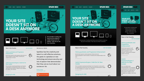
A responsive web design term is related to the concept of developing a website design in a manner that helps the lay out to get changed according to the user’s computer screen resolution. More precisely, the concept allows for an advanced 4 column layout 1292 pixels wide, on a 1025 pixel width screen, that auto-simplifies into 2 columns. Also, it suitably fixes on the smartphone and computer tablet screen. This particular designing technique we call “responsive design”.
Responsive web designing is an entirely different designing version than traditional web designing, and developers must know about the pros and cons of responsive web designing. This blog is a mighty example of the approach so we will reveal a few facts about the uses of responsive web designing. The basic instinct might be to choose media queries to develop a responsive site. However, the hassle one faces with media queries is that new queries can pop up from moment to moment; each time, the user experiences sudden and drastic changes to the look and organization of the site. Experts suggest using some CSS transitions to ease the jump.
Example of Responsive Websites
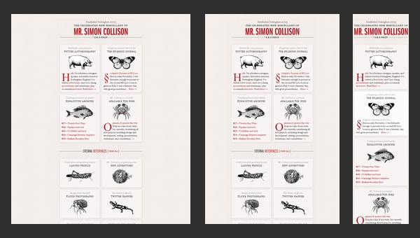
Though nowadays this greyish grid-style static website looks a bit boring and dull, however when it was released it caused some kind of furor with its high-end layout.The main reason was that the designer primarily focused its attention on responsive behavior that was only gaining popularity those days thereby providing ordinary developers with a representative example of how regular grid-style layout should gracefully transform.
Watch this tutorial to aid in creating your responsive sight
For more information click:
No comments:
Post a Comment